Ready Toast
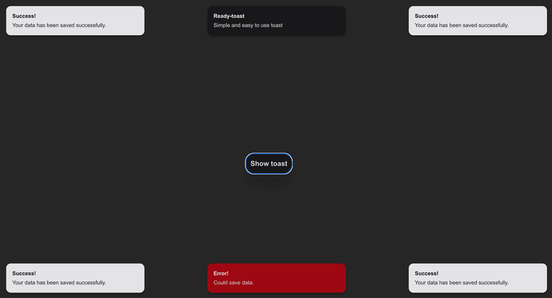
A customizable, animated, and easy-to-use toast notification component built with Radix UI, React, and Tailwind CSS. Supports usage with both Vite and Next.js. Includes standalone and context-based toast handling.
Installation
npm install ready-toast
To Get Started Simple
1.In main.jsx or _app.js
import { ToastProvider } from 'ready-toast'

function App() {
  return (
    <ToastProvider> // warp your app with ToastProvider
      <YourApp />
    </ToastProvider>
  )
}
2.To use Toast
import { useToast } from 'ready-toast'

function LoginButton() {
  const { showToast } = useToast()

  return (
    <button onClick={() => {
      showToast({
        title: "Success",
        description: "You logged in successfully.",
        position: "top-right",
        duration: 3000,
        variant: "default",
        className: "text-green-600" //pass your tailwind classes , if tailwind is installed only.
      })
    }}>
      Login
    </button>
  )
}
Also, ensure react, react-dom, tailwindcss, and @radix-ui/react-toast are installed in your project(Installation of these packages is not required to use it ).
Also, to add additional className to Toast , you requrie tailwindcss.
Features Built on Radix UI
Tailwind CSS Configuration
Ready Toast requires Tailwind CSS to be installed in the user's project. Please make sure Tailwind is set up in your project before using the ready-toast component.
If you're using Vite or Next.js, you can follow these steps to install and configure Tailwind:
Vite Installation
-
Install Tailwind CSS:
npm install tailwindcss -
Initialize Tailwind configuration:
npx tailwindcss init -
In
tailwind.config.js, ensure thecontentarray includes the following paths:module.exports = { content: [ './src/**/*.{js,jsx,ts,tsx}', // adjust for your app structure ], theme: { extend: {}, }, plugins: [], }
Next.js Installation
-
Install Tailwind CSS:
npm install tailwindcss -
Initialize Tailwind configuration:
npx tailwindcss init -
In
tailwind.config.js, ensure thecontentarray includes the following paths:module.exports = { content: [ './pages/**/*.{js,jsx,ts,tsx}', './components/**/*.{js,jsx,ts,tsx}', ], theme: { extend: {}, }, plugins: [], }
Once Tailwind is set up in your project, you can easily use ready-toast for toast notifications!
Tailwind-friendly with clsx and tailwind-merge
Supports multiple toast positions
Variants: default, dark, destructive
Works with both controlled and context-based usage
Works in both Vite and Next.js apps
🔧 Basic Usage (Controlled) jsx Copy Edit
import { Toast } from 'ready-toast'
import React, { useState } from 'react'

function Example() {
  const [open, setOpen] = useState(false)

  return (
    <>
      <button onClick={() => {
        // Re-trigger toast on click
        setOpen(false)
        setTimeout(() => setOpen(true), 10)
      }}>
        Show Toast
      </button>

      <Toast
        open={open}
        onOpenChange={setOpen}
        title="Success!"
        description="Your data has been saved successfully."
        variant="default"           // or 'dark', 'destructive'
        position="bottom-left"      // or 'top', 'bottom', 'top-left', etc.
        className="text-green-600"  // Custom Tailwind classes
      />
    </>
  )
}
App-Wide Usage with Context API
- Wrap your app with ToastProvider jsx Copy Edit
// main.jsx or _app.js
import { ToastProvider } from 'ready-toast'

function App() {
  return (
    <ToastProvider>
      <YourApp />
    </ToastProvider>
  )
}
- Use useToast() Hook Anywhere jsx Copy Edit
import { useToast } from 'ready-toast'

function LoginButton() {
  const { showToast } = useToast()

  return (
    <button onClick={() => {
      showToast({
        title: "Success",
        description: "You logged in successfully.",
        position: "top-right",
        duration: 2000,
        variant: "default",
        className: "text-green-600"
      })
    }}>
      Login
    </button>
  )
}
Props for <Toast />
| Prop | Type | Default | Description |
|---|---|---|---|
open | boolean | false | Controls toast visibility |
onOpenChange | function | — | Handler to control open state |
title | string | — | Toast title |
description | string | — | Toast description |
variant | string | "default" | "default", "dark", "destructive" |
position | string | "bottom-right" | Positions like "top", "bottom-left", etc. |
duration | number | 3000 | Auto-hide delay in milliseconds |
className | string | — | Add custom Tailwind styles |
Dependencies This package relies on:
json Copy Edit "@radix-ui/react-toast": "^1.2.11", "clsx": "^2.1.1", "lucide-react": "^0.507.0", "react": "^18 || ^19", "react-dom": "^18 || ^19", "tailwind-merge": "^3.2.0" Make sure these are available in your host project.
📄 License MIT – Use freely in personal or commercial projects.
ready-toast
Ready Simple Toast for ReactJS and NextJS using Radix UI and TailwindCSS


